
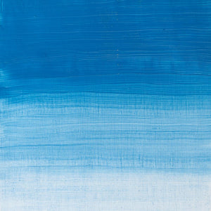
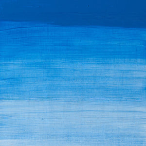
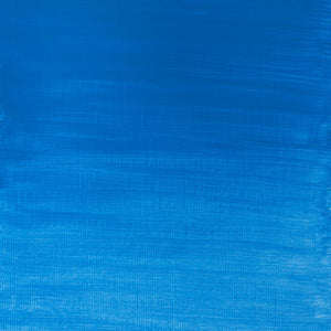
Cerulean Blue is widely considered the perfect sky-blue hue. It’s a bright, pure semi-transparent pigment with green undertones and does not react to light or chemicals, making it a permanent and invaluable addition to the artist’s palette.
Cerulean was discovered through the invention of Cobalt Blue and wasn’t widely available to artists for over five decades. When it arrived on the market, it came at a substantial cost. Despite its hurdles, Cerulean Blue has only gained in popularity, admired for its cool blue tones that are ideal for expressive skyscapes.
The discovery of Cobalt Blue and the creation of Cerulean Blue
French chemist Louis Jacques Thénard discovered Cobalt Blue in 1802, based on the blue used in Chinese porcelain. Just a few years later, in 1805, Swiss chemist Albrecht Höpfner created Cerulean Blue from cobalt stannate by the calcination of tins, salts and silica, with cobalt sulphate, resulting in a synthetic mineral pigment. However, it took 55 years for the pigment to become commercially available, when English colourman George Rowney marketed Cerulean Blue under the name ‘coeruleum’.
Cerulean Blue: the colour of the sky
The word cerulean comes from the Latin caeruleus, meaning dark blue caelum – which in turn probably derives from caelulum, translating as heaven or sky. Leatrice Eiseman, Executive Director of the Pantone Colour Institute, says: ‘Gazing at a blue sky brings a sense of peace and tranquillity to the human spirit. Sky blue is imprinted in our psyches as a retiring, quiescent colour. Surrounding yourself with Cerulean Blue could bring on a certain peace because it reminds you of time spent outdoors, on a beach, near the water – associations with restful, peaceful, relaxing times.’

Cerulean Blue was quickly adopted by artists, particularly the Impressionists in oil paintings. Monet’s La Gare Saint-Lazare (1877) is a well-known example – his sky is complimented by bright Cerulean puffs of smoke acting almost as clouds across the foggy scene. As Cerulean Blue was only recently available as a synthetic paint in tubes, it was easy to transport for painting en plain air. The artist was so intent on painting the station that he decided to rent an apartment nearby in order to visit the location. Though the setting of the busy train terminus the painting is demonstrably industrial, its format is structured similarly to landscape paintings. Aided by the clarity of Cerulean Blue, along with other bright, natural shades such as Ultramarine and Veridian, the painting becomes paradoxically light and clean, even more so when considering the painting’s urban interior viewpoint.

Cerulean Blue becomes a vibrant addition to 19th-Century artists’ palettes
Cerulean Blue – along with Cobalt Blue, synthetic Ultramarine and other vibrant colours – became part of a new set of colours quickly adopted by artists of the time who wanted to enhance their paintings with a sense of vibrance and life. Painter Jehan Georges Vibert called these intense pigments his ‘dazzlers’, while Impressionist artist Pissarro claimed to have banished the old, dull ‘earth’ colours from his palette, and Monet mixed his ochres and khakis from complex combinations of the new, bright pigments. Cerulean Blue itself was harnessed in the pointillism effects of sea and sky made by Paul Signac, and in the vibrant clothing seen in Édouard Manet’s 1878 Corner of a Café-Concert and Berthe Morisot’s 1879 Summer’s Day.

Cerulean Blue in popular culture
In the 21st century Cerulean Blue unexpectedly became part of a colour theory. In the 2006 film The Devil Wears Prada, Cerulean Blue is the shade worn by character Andy, a fashion editorial assistant, who insists that she makes no effort to follow trends. Miranda Priestley, the Editorial Director, proceeds to lecture Andy on the lineage and influence of colour, using Cerulean Blue as her guide.
Priestley says: ‘You think this has nothing to do with you. You go to your closet and you select… that lumpy blue sweater, for instance, because you’re trying to tell the world that you take yourself too seriously to care about what you put on your back. But what you don’t know is that that sweater is not just blue, it’s not turquoise, it’s not lapis, it’s actually cerulean. You’re also blindly unaware of the fact that in 2002, Oscar de la Renta did a collection of cerulean gowns… Then it filtered down through the department stores and then trickled on down into some tragic ‘casual corner’ where you, no doubt, fished it out of some clearance bin.’ Priestley uses the power of a colour such as Cerulean Blue to argue that decisions made by corporations trickles down into the everyday, whether we are aware of it or not. That no matter how disengaged someone thinks they are, the act of – in this example – buying clothes, means that you are adhering to the decisions someone is making based on the influential impact of colour.
Cerulean Blue in the modern age
Cerulean Blue is still an expensive pigment, and it remains as popular now as when it was first introduced, it’s highly prized for portraiture in particular. At first, Cerulean Blue appears strongly on the palette, but as you mix it with other colours, it becomes much weaker in strength, and it is this low-tinting strength that is Cerulean’s superpower. On the palette, it gives all sorts of options for creating a range of subtle atmospheric effects – for sky, sea, fashion and beyond.


![W&N WINTON OIL COLOUR [COMPOSITE] 37ML TITANIUM WHITE 094376711653](http://www.winsornewton.com/cdn/shop/files/9238_5073745e-fcfe-4fad-aab4-d631b84e4491.jpg?crop=center&v=1721326117&width=20)
![W&N WINTON OIL COLOUR [SPLODGE] TITANIUM WHITE](http://www.winsornewton.com/cdn/shop/files/131754_19b392ee-9bf6-4caf-a2eb-0356ec1c660a.jpg?crop=center&v=1721326118&width=20)
![WN PWC KAREN KLUGLEIN BOTANICAL SET [OPEN 3]](http://www.winsornewton.com/cdn/shop/files/136448.jpg?crop=center&v=1761625362&width=20)
![WN PWC KAREN KLUGLEIN BOTANICAL SET [FRONT]](http://www.winsornewton.com/cdn/shop/files/136444.jpg?crop=center&v=1761625362&width=20)
![WN PWC ESSENTIAL SET [CONTENTS 2]](http://www.winsornewton.com/cdn/shop/files/137579.jpg?crop=center&v=1761625558&width=20)
![WN PWC ESSENTIAL SET [FRONT]](http://www.winsornewton.com/cdn/shop/files/137583.jpg?crop=center&v=1761625558&width=20)
![W&N GALERIA CARDBOARD SET 10X12ML 884955097809 [OPEN]](http://www.winsornewton.com/cdn/shop/files/138856.jpg?crop=center&v=1761626083&width=20)
![W&N GALERIA CARDBOARD SET 10X12ML [B014096] 884955097809 [FOP]](http://www.winsornewton.com/cdn/shop/files/138855.jpg?crop=center&v=1761626083&width=20)
![W&N PROMARKER 24PC STUDENT DESIGNER 884955043295 [OPEN]](http://www.winsornewton.com/cdn/shop/files/78675_d6356b09-bd48-4280-8df1-eefc85a4de3b.jpg?crop=center&v=1761841229&width=20)
![W&N PROMARKER 24PC STUDENT DESIGNER 884955043295 [FRONT]](http://www.winsornewton.com/cdn/shop/files/78674_d4d78a69-7150-4bf4-a504-3cb5304b0f80.jpg?crop=center&v=1721326116&width=20)

![W&N PROFESSIONAL WATER COLOUR TYRIAN PURPLE [SWATCH]](http://www.winsornewton.com/cdn/shop/files/136113.jpg?crop=center&v=1724423390&width=20)