
Adam was also a winner of our International Art Prize in 2024.
The batik technique plays a significant role in your recent work. How does the physical process of batik – sketching, waxing, colouring, and boiling – inform your understanding of the themes of dislocation, identity, and cultural continuity?
I started using these materials as a way for me to personally engage with my history. The only reason I know how to make batik is because I'm very patient and polite. Old women allowed me to sit in their workshops for weeks and months on end. It felt like another example of the colonial expression which is linked to my ancestry. I wanted to have a legitimate understanding of the practice and to acknowledge my ancestry.

Tell us about your hometown.
Los Angeles is a very culturally diverse city, like most modern cities. But what is interesting about it for me is it's modern with a capital M. I see it as a modern invention with the history of Hollywood and music.
Beyond your heritage and the formal study of craft, where else do you find inspiration in your daily life, especially in a city as vibrant and diverse as Los Angeles?
It's a city where anything goes and where it's totally comfortable.

You find inspiration through sketching and working around Echo Park Lake. What is it about this location that speaks to you?
Echo Park Lake is a place of beauty. It’s also situated in a diverse neighborhood, so depending on the time of day that you go, different types of people are utilising the space.
A couple of years ago I made a painting about Echo Park Lake based on the four different times of day. So, one for the morning, one for midday, one for the afternoon and one at night when the park closes. It was interesting to spend so much time out there and just really see the rhythm of that place, not only trying to notice the way that the colours change but also the different types of people that are around and what they're up to. Everything is from direct observation and lived experience. And one piece usually begins another piece.

Your practice involves traditional Javanese crafts like batik textile design and woodcarving. How do you navigate the balance between preserving these traditional techniques and infusing them with your contemporary, hybrid identity?
What's interesting in Los Angeles is I spent so much time talking about the material of batik, because people are kind of ignorant of it, even though most people own some. And then in Indonesia or Singapore, I spend so much time defending my use of it. People come to the opening and say, why are you using batik?
I had a show in Bogotá in 2013, and the Indonesian ambassador and his wife came to my opening and showed up the next day with some of her batik collection and started trying to put it up on the walls as if to say the one I made is bad. That is not a good expression of Indonesian culture. But the thing is, I love that because I don't mind that it's bad and these are all kind of records of my development and my capabilities and learning.
So, where they're messy or when they don't necessarily meet the proper definitions of an oil painting or the proper definitions of a textile – that slipperiness, that hybridity – is exactly where the art lives for me. And it's where I live, in my identity, in my life.

What are your favourite Winsor & Newton materials?
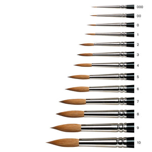
The Series 7 brushes and the Cotman Watercolour brushes. They hold their shape incredibly well, even after a few washes. I'm hooked! I know they're designed for watercolour but I regularly use them for oil paint and they perform amazingly well. They keep their shape over time better than any other brush I've tried and they are so easy to clean! They're truly exceptional.
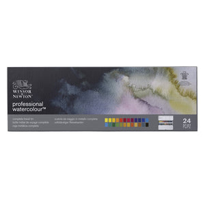
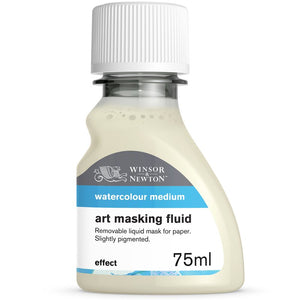
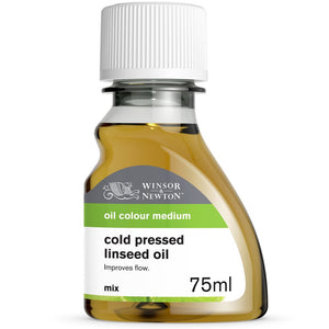
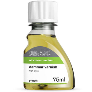
My favourite ‘drawing’ materials have long been the 'Professional Watercolour' series out of the tube rather than the pans, used in conjunction with Art Masking Fluid. For oil painting, I love the Sansodor solvent for cleaning up, but I use it to make a simple three-part medium along with Cold-Pressed Linseed Oil and Dammar Varnish.
And what about your favourite colours?
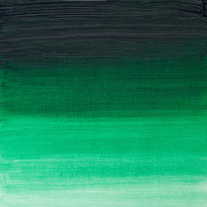
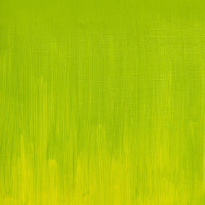
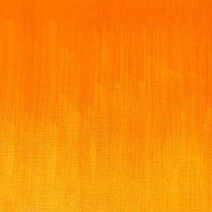
Winsor Green (Yellow Shade) is one of my favourite colours, but I like all the Artists' Oil Colour cadmium hues as well. I have used Winsor Green since my student days. Something about the Winsor hue is really accurate when depicting the dark blue green of the Canary Island palm fronds that often appear in my work. Adding white or black to it both work well too. Lately, I've been painting the Los Angeles landscape from direct observation and these specific trees are everywhere, so I use a lot of Winsor Green!


![WN PWC KAREN KLUGLEIN BOTANICAL SET [OPEN 3]](http://www.winsornewton.com/cdn/shop/files/136448.jpg?crop=center&v=1761625362&width=20)
![WN PWC KAREN KLUGLEIN BOTANICAL SET [FRONT]](http://www.winsornewton.com/cdn/shop/files/136444.jpg?crop=center&v=1761625362&width=20)
![WN PWC ESSENTIAL SET [CONTENTS 2]](http://www.winsornewton.com/cdn/shop/files/137579.jpg?crop=center&v=1761625558&width=20)
![WN PWC ESSENTIAL SET [FRONT]](http://www.winsornewton.com/cdn/shop/files/137583.jpg?crop=center&v=1761625558&width=20)
![W&N GALERIA CARDBOARD SET 10X12ML 884955097809 [OPEN]](http://www.winsornewton.com/cdn/shop/files/138856.jpg?crop=center&v=1761626083&width=20)
![W&N GALERIA CARDBOARD SET 10X12ML [B014096] 884955097809 [FOP]](http://www.winsornewton.com/cdn/shop/files/138855.jpg?crop=center&v=1761626083&width=20)
![W&N PROMARKER 24PC STUDENT DESIGNER 884955043295 [OPEN]](http://www.winsornewton.com/cdn/shop/files/78675_d6356b09-bd48-4280-8df1-eefc85a4de3b.jpg?crop=center&v=1761841229&width=20)
![W&N PROMARKER 24PC STUDENT DESIGNER 884955043295 [FRONT]](http://www.winsornewton.com/cdn/shop/files/78674_d4d78a69-7150-4bf4-a504-3cb5304b0f80.jpg?crop=center&v=1721326116&width=20)

![W&N PROFESSIONAL WATER COLOUR TYRIAN PURPLE [SWATCH]](http://www.winsornewton.com/cdn/shop/files/136113.jpg?crop=center&v=1724423390&width=20)
![W&N WINTON OIL COLOUR [COMPOSITE] 37ML TITANIUM WHITE 094376711653](http://www.winsornewton.com/cdn/shop/files/9238_5073745e-fcfe-4fad-aab4-d631b84e4491.jpg?crop=center&v=1721326117&width=20)
![W&N WINTON OIL COLOUR [SPLODGE] TITANIUM WHITE](http://www.winsornewton.com/cdn/shop/files/131754_19b392ee-9bf6-4caf-a2eb-0356ec1c660a.jpg?crop=center&v=1721326118&width=20)