

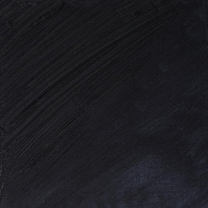
Created by 18th-century watercolourist William Payne, the dark blue-grey pigment was recommended to his students as a softer alternative to black. This, along with its versatility, has secured the colour a place in many different mediums. Payne’s Gray makes an appearance throughout the Winsor & Newton range in oil, acrylic, gouache, drawing inks and watercolour. Its enduring demand and role in the artist’s palette have made it a staple pigment for centuries.
The many shades of Payne’s Gray
The term ‘Payne’s grey’ is a relatively broad term. Over the centuries a number of colour combinations have called themselves Payne’s grey. Most versions are a mix of pigments rather than a single one, and sit somewhere between blue, charcoal and muted black. They can lean cool, particularly in watercolours, appear green-grey or even neutral smoky grey. Some recipes include Indigo instead of Prussian Blue, and others Burnt Sienna. Historically, the colour was an intense mix of Ultramarine, Lamp Black and Crimson.
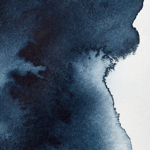
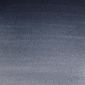
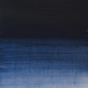
Winsor & Newton’s Payne’s Gray is made up of cool Phthalo Blue, Lamp Black and Quinacridone Rose. It is slightly bluer and livelier than other combinations, and many artists notice that it behaves differently from a simple neutral grey. The secret to this is the addition of the crimson-magenta Quinacridone Rose, which gives a hidden warmth and complexity. In deep washes it can feel stormy blue-black; diluted, it can reveals smoky violet undertones.
The artist behind the name
Not much is recorded about William Payne's life, and as a result his namesake colour. Believed to have been born in Exeter, Devon, around 1760, Payne worked as a civil engineer before becoming a painter and watercolour tutor. He lived in London, teaching students how to paint natural scenes, along with achieving some success selling and exhibiting art. One of his known mark-making techniques involved using unconventional household objects such as cloths or even bread to lift and smudge wet pigment. But it was the notable invention of Payne’s Gray that cemented his name in artists’ paint sets.
Cool-toned shadows
Payne’s first formula was a mixture of Prussian Blue, Yellow Ochre and Crimson Lake. The resulting shade was used as a kind of quiet rebellion against dense blacks. It is often described as a ‘fast shadow’ colour because it quite quickly achieves depth without the flatness black can introduce. At the time, many artists would have been using India ink or Lamp Black. Payne disliked the dull look black could give skies and landscapes, and so, sometime during the 1790s and early 1880s, he promoted his deep blue-grey mixture. The first official use of the pigment’s name was recorded much later, however, in 1835, after Payne’s death.
Payne's Gray in watercolour
Payne’s Gray transformed the medium of watercolour and landscape painting by giving a nuanced, cool tone to shadows, allowing artists to add detail and depth instead of simply darkness. The pigment’s ability to dilute well in soft washes also provided the perfect tool for adding perspective and creating distance. It is considered quite an emotive colour, and rightly so – Payne believed in painting from feeling just as much from seeing. ‘Untitled River Scene’ demonstrates the artist’s extensive use of Payne’s Gray for atmospheric effect in his portrayal of distant landmarks, faded daylight and the rippling movement of water.
The colour of English rain
Payne’s Gray is also used in underpainting and monochrome compositions. Artist George Shaw named his 2011 collection of monochromatic watercolours ‘Payne’s Gray’, and has described the shade as “the colour of English rain.”
The colour has helped shape landscape painting in all its changeable weathers. It is still very much enjoyed for illustrating natural landscapes – from rocky outcrops, hazy mountains and misty seascapes to details in stonework, foliage and rain-smattered botanicals. It is also popular in sketching, for creating realism and detail.
William Payne’s work can be found today at the Victoria & Albert and British Museum in London, The Box in Plymouth, the National Gallery of Art in Washington DC, and the Metropolitan Museum of Art, New York.


![W&N WINTON OIL COLOUR [COMPOSITE] 37ML TITANIUM WHITE 094376711653](http://www.winsornewton.com/cdn/shop/files/9238_5073745e-fcfe-4fad-aab4-d631b84e4491.jpg?crop=center&v=1721326117&width=20)
![W&N WINTON OIL COLOUR [SPLODGE] TITANIUM WHITE](http://www.winsornewton.com/cdn/shop/files/131754_19b392ee-9bf6-4caf-a2eb-0356ec1c660a.jpg?crop=center&v=1721326118&width=20)
![WN PWC KAREN KLUGLEIN BOTANICAL SET [OPEN 3]](http://www.winsornewton.com/cdn/shop/files/136448.jpg?crop=center&v=1761625362&width=20)
![WN PWC KAREN KLUGLEIN BOTANICAL SET [FRONT]](http://www.winsornewton.com/cdn/shop/files/136444.jpg?crop=center&v=1761625362&width=20)
![WN PWC ESSENTIAL SET [CONTENTS 2]](http://www.winsornewton.com/cdn/shop/files/137579.jpg?crop=center&v=1761625558&width=20)
![WN PWC ESSENTIAL SET [FRONT]](http://www.winsornewton.com/cdn/shop/files/137583.jpg?crop=center&v=1761625558&width=20)
![W&N GALERIA CARDBOARD SET 10X12ML 884955097809 [OPEN]](http://www.winsornewton.com/cdn/shop/files/138856.jpg?crop=center&v=1761626083&width=20)
![W&N GALERIA CARDBOARD SET 10X12ML [B014096] 884955097809 [FOP]](http://www.winsornewton.com/cdn/shop/files/138855.jpg?crop=center&v=1761626083&width=20)
![W&N PROMARKER 24PC STUDENT DESIGNER 884955043295 [OPEN]](http://www.winsornewton.com/cdn/shop/files/78675_d6356b09-bd48-4280-8df1-eefc85a4de3b.jpg?crop=center&v=1761841229&width=20)
![W&N PROMARKER 24PC STUDENT DESIGNER 884955043295 [FRONT]](http://www.winsornewton.com/cdn/shop/files/78674_d4d78a69-7150-4bf4-a504-3cb5304b0f80.jpg?crop=center&v=1721326116&width=20)

![W&N PROFESSIONAL WATER COLOUR TYRIAN PURPLE [SWATCH]](http://www.winsornewton.com/cdn/shop/files/136113.jpg?crop=center&v=1724423390&width=20)
