THE ARTIST
Wilhelmina Barns-Graham
Wilhelmina Barns-Graham (1912-2004) was one of the foremost British abstract painters. Her paintings, alongside those of her contemporaries who comprised of the St Ives School and Newlyn Society of Artists, contributed greatly to the development of Modernist British painting in the mid to late twentieth century.

Step 1
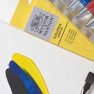
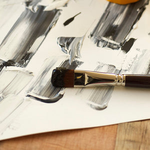
First of all, try using the colours in your set undiluted. With Galeria brushes, you can create thick, heavy textures, known as Impasto. Then for contrast, you can achieve longer, looser, and more fluid marks by diluting the paint with a little water.

Step 2
To explore the versatility of acrylic further, experiment with your brushes and use them to make different lines, with the other end of the brush you can even scratch into the paint to create sgraffito-like marks, which will give you a really different texture. Introduce other primary colours; red, yellow, and blues in layers.

Step 3
Now try adding white to your composition or layout. Then using both the dry brush technique we started out with in the first step and then loosening the paint with water to extend your marks, you can observe how opaque or transparent each of the colours are and layer them one on top of another.

Step 4
For a more graphic approach, you can work edge to edge on your surface, letting any strong marks you make just extend out over the end of your acrylic paper or canvas board. Just rest the surface on top of a larger piece of acrylic paper or other surface.

Step 5
Using Wilhemina Barns-Graham as your inspiration and observing her work, add more layers using another primary colour, and continue experimenting with mark-making by using both thick and thin paint applications with different lines and textures.

Step 6
Mix complementary colours together to create darker tones. Red is complementary to green, blue is complementary to orange, and yellow is complementary to violet. See how this contrast impacts on the other colours. Try adding a little Gloss Gel medium to your paint to increase its texture and gloss.

Step 7
Keep layering marks and colour to cover your surface, look at how one colour impacts on another– we often think that blue is a cool colour and red is a warm one, however you can get both warm and cool tones in these colours, which you might not expect.

Step 8
Having experimented with mark-making, colour mixing and the addition of mediums, develop a balanced composition using a combination of all these different approaches. Try adding some white and observe how darker colours appear to make the lighter colours brighter.


![WN PWC KAREN KLUGLEIN BOTANICAL SET [OPEN 3]](http://www.winsornewton.com/cdn/shop/files/136448.jpg?crop=center&v=1724423264&width=20)
![WN PWC KAREN KLUGLEIN BOTANICAL SET [FRONT]](http://www.winsornewton.com/cdn/shop/files/136444.jpg?crop=center&v=1724423264&width=20)
![WN PWC ESSENTIAL SET [CONTENTS 2]](http://www.winsornewton.com/cdn/shop/files/137579.jpg?crop=center&v=1724423213&width=20)
![WN PWC ESSENTIAL SET [FRONT]](http://www.winsornewton.com/cdn/shop/files/137583.jpg?crop=center&v=1724423213&width=20)
![W&N GALERIA CARDBOARD SET 10X12ML 884955097809 [OPEN]](http://www.winsornewton.com/cdn/shop/files/138856.jpg?crop=center&v=1724893209&width=20)
![W&N GALERIA CARDBOARD SET 10X12ML [B014096] 884955097809 [FOP]](http://www.winsornewton.com/cdn/shop/files/138855.jpg?crop=center&v=1724893209&width=20)

![W&N PROMARKER 24PC STUDENT DESIGNER 884955043295 [FRONT]](http://www.winsornewton.com/cdn/shop/files/78674_d4d78a69-7150-4bf4-a504-3cb5304b0f80.jpg?crop=center&v=1721326116&width=20)

![W&N PROFESSIONAL WATER COLOUR TYRIAN PURPLE [SWATCH]](http://www.winsornewton.com/cdn/shop/files/136113.jpg?crop=center&v=1724423390&width=20)
![W&N WINTON OIL COLOUR [COMPOSITE] 37ML TITANIUM WHITE 094376711653](http://www.winsornewton.com/cdn/shop/files/9238_5073745e-fcfe-4fad-aab4-d631b84e4491.jpg?crop=center&v=1721326117&width=20)
![W&N WINTON OIL COLOUR [SPLODGE] TITANIUM WHITE](http://www.winsornewton.com/cdn/shop/files/131754_19b392ee-9bf6-4caf-a2eb-0356ec1c660a.jpg?crop=center&v=1721326118&width=20)